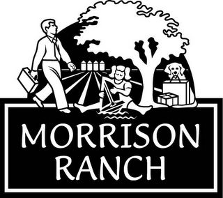
Looking Back at The Logo

Morrison Ranch Logo

We had a milestone in the office recently; Bias For Action presented us with the 500th weekly agenda. For the math-challenged like me, that's about ten years worth of weekly agendas. So we were reading over some of the earlier ones, and reminiscing about various things we'd worked on through the years. I remember the discussions around coming up with our logo. We had some professional help, and we started by deciding what we wanted to communicate. Morrison Ranch is a community, one where we dreamed of residents being able to live, work, shop, play, and recreate, all within the borders of the community. We wanted to stress the pedestrian-friendly atmosphere, as well as the family-friendly atmosphere. After MUCH discussion, revision, more discussion, more revision, trying to get it right (the little girl looked too old, the dog was too big, take off the man's jacket, things like that) we settled on this logo. The signature grain tanks are in the background; the tree plays a LARGE part in our landscaping scheme, the dog holds a shopping bag in it's mouth, the briefcase denotes work, and the sailboat denotes play. Complex, yes, but the concepts are all quite simple, and all quite important to us. It's fun for me to see many of the concepts in reality, in flesh and blood, from the dogs to the pedestrians, to the lake, to the opening stores at Lakeview Village. Dreams take a while to realize sometimes; I'm privileged to watch one starting to materialize before my very eyes.

0 Comments:
Post a Comment
<< Home